PowerPoint Slide Design Principles for Consultants
Key Takeaways
- Keep slides simple and focused to communicate your message clearly.
- Use consistent fonts, colors, and layouts to build trust and professionalism.
- Leverage visuals like charts and icons to make data easy to understand.
- Apply the rule of thirds and white space for balanced slide composition.
- Tailor your slide design to your audience’s needs and your consulting goals.
As a consultant, your presentations are more than just slides—they’re your story, your expertise, and your value all wrapped into one. But here’s the catch: no matter how brilliant your ideas, a cluttered or confusing PowerPoint can undermine your entire message. I’ve helped hundreds of consultants transform their slides into powerful tools that win clients and build credibility. Today, I’m sharing the essential PowerPoint slide design principles that every consultant needs to know.
1. Embrace Simplicity: Less Is More
One of the biggest mistakes consultants make is trying to fit too much information on a single slide. When your audience faces a wall of text or complicated charts, they tune out. The best slides have a single, clear message. Use short, punchy headlines and limit bullet points to three or four items.
For example, instead of writing a paragraph about your project timeline, break it down into a simple visual timeline or a few key milestones. Research from the Harvard Business Review shows that people retain 65% of information when it’s presented visually versus just 10% when it’s read as text.
Remember, slides are visual aids, not scripts. Save the details for your speech, and use the slide to highlight only what matters most.
2. Maintain Consistency in Design Elements
Consistency is key to looking professional and trustworthy. Use a uniform color palette, fonts, and slide layouts throughout your deck. This helps your audience focus on your message instead of being distracted by shifting styles.
Choose fonts that are clean and easy to read, like Arial, Calibri, or Helvetica. Stick to two typefaces max—one for headings and one for body text. For colors, select a palette that matches your brand or client’s branding. Tools like Adobe Color can help you pick harmonious colors.
Here’s a quick comparison of consistent vs. inconsistent slide decks:
| Consistent Design | Inconsistent Design |
|---|---|
| Uniform fonts and sizes | Mixes multiple fonts and sizes randomly |
| Coherent color scheme | Uses clashing colors without pattern |
| Aligned and balanced layouts | Random placements and uneven spacing |
| Professional, polished look | Distracting and unprofessional |
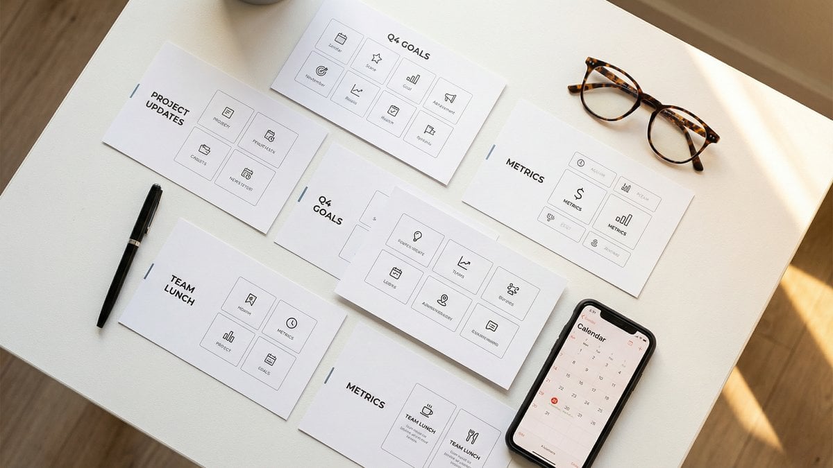
3. Use Visuals to Make Data Digestible
Consultants often deal with complex data and analysis. The secret to effective slide design is turning that data into visuals your audience can quickly grasp. Charts, graphs, icons, and images can clarify your points and keep your audience engaged.
For example, instead of listing percentages in a table, use a pie chart or bar graph. Icons can replace words like “growth,” “strategy,” or “cost savings” to make slides more dynamic and less text-heavy.
Gallup research confirms that visuals increase learning and retention by up to 400%. Visual aids help clients remember your insights long after the presentation ends (Gallup).
To create sleek visuals, consider presentation tools like Pitch, which offers modern templates and easy drag-and-drop features to build compelling slides quickly.
4. Apply the Rule of Thirds and White Space
Good slide design isn’t just what you put on the slide—it’s also about what you leave out. White space (empty space) is crucial. It prevents slides from feeling cluttered and directs the viewer’s attention to key elements.
A handy guideline is the rule of thirds. Imagine your slide divided into a 3×3 grid. Place the most important content along these lines or where they intersect. This creates natural balance and makes your slides easier to read.
Here’s how you can use this principle:
- Align text boxes and images to one-third or two-thirds of the slide width.
- Leave breathing room around charts and key points.
- Limit the number of elements per slide to 2–3.
Applying these techniques makes your presentation look clean, professional, and easier on the eyes.
5. Tailor Your Slides for Your Audience
Every consulting engagement is different, and so should be your slides. Think about who you’re presenting to and what they care about. A CEO might want a high-level overview with clear business impact, while a technical team might need detailed charts and data.
Adjust your design and content accordingly. Use language your audience understands. Avoid jargon if it’s a non-expert group. And always emphasize benefits or solutions that resonate with their needs.
For example, a slide deck for a startup pitch should be sleek and concise, emphasizing growth potential and market opportunity. In contrast, a project update for an internal team might include more detailed timelines and task lists.

If you want to dive deeper into step-by-step slide creation, check out my How to Make a Professional PowerPoint Presentation: A Step-by-Step Tutorial and Best PowerPoint Design Tips for Business: Create Presentations That Win.
Conclusion: Design Slides That Speak for You
Great PowerPoint slide design is a skill every consultant can master. By keeping your slides simple, consistent, and visual, you make your ideas clear and memorable. Use white space and layout principles to create balance, and always tailor your slides to your audience’s needs.
When your slides support your expertise rather than distract from it, you build trust and make a stronger impact. Remember, your presentation is your chance to show why you’re the consultant your clients need.
Ready to transform your presentations? Work with Melinda at TheSlidehouse →
🎁 Free Download: 5 Slides That Win Clients
Enter your email to get instant access to your free Presentation Design Cheat Sheet + the 5 slides every winning client deck must have.
Frequently Asked Questions
What is the most important design principle for consultants’ slides?
Simplicity is the most important principle. Slides should focus on one key message each and avoid clutter. This helps your audience understand and remember your points.
How many bullet points should I use on a slide?
Limit bullet points to three or four per slide. Too many points overwhelm viewers and dilute the message.
Can I use multiple colors and fonts in my presentation?
It’s best to use a consistent color palette and no more than two fonts. This creates a professional and cohesive look.
Are visuals really necessary in consultant presentations?
Yes! Visuals like charts and icons help explain complex data and keep your audience engaged. Studies show visuals improve information retention significantly.
Need a presentation designed for you? TheSlidehouse creates professional slide decks for consultants, business owners, and entrepreneurs. Get started here →
If you want to draft presentations faster without starting from a blank slide, Gamma is a practical option for turning ideas into polished decks and visual documents more quickly.
For additional research, see Nielsen Norman Group for research-backed communication and UX.

Melinda Pearson is the founder of The Slide House and a presentation designer with 10+ years of experience helping consultants, startup founders, and business owners turn complex ideas into clear, persuasive slide decks. Learn more about Melinda.
Frequently Asked Questions
What should powerpoint slide design principles for consultants include?
PowerPoint Slide Design Principles for Consultants should include a clear narrative, concise visuals, and a direct explanation of what the audience should do next.
How long should powerpoint slide design principles for consultants be?
Most business presentations work best when each slide has one core point and the overall deck stays focused on the decision being made.
How can I make the slides more persuasive?
Use evidence, strong structure, and examples that match the audience’s priorities, then reinforce the recommendation with a clear next step.
Should I include supporting data?
Yes. Use only the evidence that helps the audience make the decision, and present it in a visual format that is easy to understand quickly.