Presentation Trends 2026: What’s Actually Changing
Your deck from 2023 probably looks dated now. Not in a catastrophic way — but noticeably. The trends that dominated three years ago have quietly shifted. Minimalism is still king, but it’s evolving. Video integration is no longer optional. And the biggest surprise? The best presentations in 2026 are actually shorter, not longer.
Disclosure: This article contains affiliate links. If you click a link and make a purchase, The Slide House may earn a small commission at no extra cost to you. We only recommend tools we genuinely believe will help you create better presentations. Read our full Affiliate Disclosure.
Here’s what I’m seeing in client work, and what you need to know to stay competitive.
Key Takeaways
- Slide counts are dropping dramatically — 12-15 slides is now standard for major pitches, down from the 25-30 slide norm of 2020
- Authentic, imperfect design is replacing polished sterility — real photos and messy whiteboard shots outperform stock imagery
- Interactive elements and live data visualizations are becoming baseline expectations, not optional features
- Personal brand consistency across all presentation platforms is now a competitive advantage
The Slide Count Revolution
Let me start with the most radical shift I’ve witnessed: slide counts have collapsed.
In 2020, a Series A pitch deck ran 25-30 slides. A client pitch to a Fortune 500 company? 40-50 slides was normal. Today? A pitch deck that wins funding is 12-15 slides, maximum. I worked with a SaaS founder in late 2025 who had a 24-slide deck. We cut it to 8 slides and restructured the narrative. She closed her Series A in 11 days. The investor feedback was direct: “You got to the point. We appreciated that.”
This isn’t about attention spans, though that’s part of it. It’s about clarity. When you’re forced to cut 50% of your content, you stop explaining your product and start proving your value. You eliminate justifications and focus on outcomes. Every slide earns its place.

The rule I use now: one key idea per slide. One. If a slide contains two distinct points, it gets split or deleted. This forces ruthlessness. It works.
Authenticity Over Aesthetics
Stock photography is dead. Truly dead.
In 2024, everyone still used those glossy Unsplash images of people laughing at salads. Now? The presentations winning deals use real photos. Messy desks. Team members actually looking awkward. Screenshots of real customer dashboards, not mock-ups. Whiteboard photos. Rough sketches.
Why? Because authentic imagery creates trust. It signals that you’re too busy building something real to polish everything to perfection. Paradoxically, imperfection is now more persuasive than perfection.
I recommend this approach to every founder we work with: replace one generic stock image with something from your actual office, product, or customer site. Watch how it changes the energy of the slide. People feel the difference immediately.
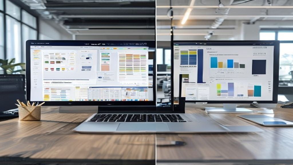
Data Visualization That Actually Works
Charts are everywhere in presentations. Most of them are useless.
The trend in 2026 is away from multi-color, over-annotated charts toward single-metric visualizations. You pick one number and make it impossible to miss. A pie chart showing five slices? Gone. A simple bar chart showing revenue growth across three years? Perfect.
But here’s the real shift: interactive data visualizations are now expected in high-stakes presentations. This means live dashboards embedded in your deck, charts that update in real-time, or the ability to drill down into data during the presentation itself. If you’re pitching to a data-driven organization, a static chart is now seen as outdated.
Tools have made this easier. You no longer need engineering support to embed live data. But the expectation is clear: if you’re presenting financial projections, market data, or customer metrics, show the live source. Not a screenshot from three weeks ago.
| Chart Type | When to Use | Strengths | Weaknesses |
|---|---|---|---|
| Single metric (KPI) | High-stakes pitches, executive updates | Impossible to misinterpret, builds confidence | Requires ruthless focus, may oversimplify |
| Bar chart (3-4 categories) | Comparisons, trend analysis | Intuitive, fast to read | Limited to four data points before confusion |
| Interactive dashboard | Investor pitches, Board meetings | Shows rigor, allows exploration, modern | Complex setup, can distract from narrative |
| Pie charts | Avoid entirely | None | Inaccurate human perception, wastes space |
The Video Integration Shift
Video in presentations used to feel risky. You’d embed a two-minute customer testimonial and hope the WiFi didn’t fail.
Now, video is baseline. But it’s not what you’d expect. The trend isn’t toward polished, produced videos. It’s toward short, raw, authentic clips. A customer talking for 90 seconds. A founder explaining the origin story on their phone camera. A 30-second time-lapse of the product being built.
These videos serve a specific purpose: they replace yourself for a moment. If you’re presenting to an investor and you want them to hear from your customer, a one-minute video is infinitely more powerful than you describing what the customer said. The viewer gets tone, emotion, conviction — things you can’t convey by paraphrasing.
The technical shift is important too. Embedded videos now play reliably in both Keynote and PowerPoint on most systems. The bandwidth problems that plagued presenters five years ago are largely solved. This removes the excuse for not using video.
Personal Brand Consistency
Here’s something I don’t see discussed elsewhere: your presentation is now part of your brand ecosystem. And it needs to feel cohesive with everything else you publish.
If you’re a consultant publishing articles, LinkedIn posts, and client presentations, they should all feel like they came from the same person. Same color palette. Same typeface choice. Same tone in the speaker notes. The consistency reinforces that you’re serious, intentional, and professional.
This is harder than it sounds. Most people treat their presentations as one-offs, separate from their brand presence. But in 2026, consistency is a quiet competitive advantage. When a prospective client sees your article, your LinkedIn profile, and your pitch deck, and they all feel connected? That builds trust.
We implemented this for a management consultant who was struggling to differentiate from competitors. She wasn’t changing her actual content — she was refining the visual language across her deck, her website, and her published research. The result? More inquiries. Better-qualified leads. Same value proposition, clearer presentation.
One specific action: audit your presentations, website, and published content. List the three colors that appear most frequently. Pick the typeface you use in your brand materials. Now open your most recent presentation and check — does it match? If not, you have a quick fix that will yield real returns.
The Rise of Presentation Customization
Generic decks are dying. Not templates — custom decks built specifically for the audience.
In 2024, you could use the same pitch deck for five different investors. Now? Investors expect you to have customized your deck for them. Same core narrative, but different emphasis. Different examples. Different data points tailored to what that specific investor cares about.
This creates more work, but it creates disproportionate returns. When you present to an investor and they see data about market segments they focus on, customer profiles they know, and examples from their portfolio companies, they feel seen. Personalization matters.
The same applies to client presentations. If you’re pitching to three different departments within a Fortune 500 company, each should receive a slightly different narrative flow. The finance team gets different metrics than the operations team. You’re not lying or shifting your value proposition — you’re showing that you understand their specific priorities.
This is why slide templates have become less useful. You need flexibility. You need the ability to customize quickly. If you’re creating pitches regularly, consider working with a designer who builds custom templates for your specific use cases, rather than buying off-the-shelf slide templates. For guidance on this, check out our best tools for creating presentations online 2026 — the most useful tools today are ones that let you customize rapidly without starting from scratch.
Conclusion
The biggest shift in presentation trends for 2026 isn’t about technology. It’s about clarity and authenticity. Slides are shorter. Imagery is realer. Data is interactive. And personalization is expected, not optional.
If you take one action today, cut your current deck by 30%. Delete slides that don’t directly answer one of these questions: What’s the problem? Why do you matter? What do you need from this audience? Every slide should earn its place by answering one of those three questions. The ones that don’t? They’re making your presentation weaker.
Need a presentation designed for you? TheSlidehouse creates professional slide decks for consultants, business owners, and entrepreneurs. Get started here →
Need a presentation designed for you? TheSlidehouse creates professional slide decks for consultants, business owners, and entrepreneurs. Get started here →
If you want to draft presentations faster without starting from a blank slide, Gamma is a practical option for turning ideas into polished decks and visual documents more quickly.
For additional research, see Harvard Business Review for business communication and leadership. For additional research, see Nielsen Norman Group for research-backed communication and UX.

🎁 Free Download: 5 Slides That Win Clients
Enter your email to get instant access to your free Presentation Design Cheat Sheet + the 5 slides every winning client deck must have.
Frequently Asked Questions
What’s the ideal slide count for a pitch deck in 2026?
The new standard is 12-15 slides for investor pitches. This is down from 25-30 slides just a few years ago. The constraint forces you to prioritize ruthlessly and focus on outcomes rather than explanations. Each slide should contain one core idea, and every slide must earn its place in the narrative.
Should I still use stock photos in my presentations?
Avoid them if possible. Real, authentic imagery now outperforms polished stock photos. Use actual photos from your office, product, customer sites, or team. Imperfect, genuine imagery builds more trust than perfectly curated stock images. If you must use stock photos, choose ones that feel candid rather than posed.
Do I need to include video in every presentation?
Not in every slide, but video should be part of your strategy for high-stakes presentations. Use short, authentic video clips (60-90 seconds) to let customers, team members, or yourself tell part of the story. Video replaces lengthy text explanations and creates emotional connection that slides alone cannot achieve.
How do I customize presentations for different audiences?
Keep your core narrative consistent, but adjust emphasis and examples for each audience. Change which data points you highlight, which customer stories you feature, and which problems you emphasize. Use the same template but with flexible content sections. This shows audiences you understand their specific priorities without requiring you to rebuild the entire deck from scratch.