
Color Palettes for Business Presentations 2026
The colors in your presentation deck aren’t decoration. They’re persuasion. In my decade of designing slides for Fortune 500 consultants and startup founders, I’ve watched color choice determine whether a client pays attention or glances at their phone. This year, the rules have shifted. The palettes that worked in 2024 feel dated now. The muted, monochromatic trend is dying. And if you’re still leaning on bright primary colors, you’re signaling that your deck was designed by committee, not strategy.
Disclosure: This article contains affiliate links. If you click a link and make a purchase, The Slide House may earn a small commission at no extra cost to you. We only recommend tools we genuinely believe will help you create better presentations. Read our full Affiliate Disclosure.
This article cuts through the noise. I’ll show you exactly which color palettes work in 2026, why they work, and how to apply them to your specific business context. You’ll also see what happened when we completely reimagined a client’s color scheme and how it changed their outcome.
Key Takeaways
- Warm neutrals paired with deep jewel tones dominate professional presentations in 2026—moving away from the cold, minimalist aesthetic of previous years
- A single accent color strategy performs better than multi-color palettes when the goal is persuasion and decision-making
- Testing your color palette with real stakeholders before finalizing your deck prevents costly redesigns and improves stakeholder buy-in
- Cultural color psychology varies significantly; what signals trust in one market may signal caution in another
The Shift Away From Minimalism: What’s Actually Working in 2026
For years, the design world told us: white space is good, color is noise, less is more. This wisdom came from mobile app design and has been copy-pasted into boardrooms ever since. But something changed in late 2024 and early 2025. Audiences got tired of looking at gray and white decks. They felt cold. Sterile. Untrustworthy.
What I’m seeing now in successful presentations is the opposite: intentional warmth paired with restraint. Warm beiges, soft taupes, and creamy off-whites form the foundation. Then one deeply saturated color—usually in the jewel tone family—provides contrast and draws the eye. Think deep emerald. Rich navy. Warm burgundy. These colors feel expensive. Confident. Human.
A SaaS founder we worked with in Q1 2026 came to us with a deck using bright Slack blue and flat gray. It looked like a template. No personality. No differentiation from their competitors. We rebuilt the entire color story around a warm stone gray background with a single accent in deep teal. Same slide structure. Same content. Same 12 slides. The founder presented to three potential investors in consecutive weeks. She closed two of them. When we followed up three months later, she told us the investors specifically mentioned feeling the presentation was “premium” and “trustworthy.” That’s not a coincidence. That’s color psychology at work.

The implication for your 2026 presentations? Stop treating color as decoration. Treat it as strategy.

The Five Color Palettes That Win Deals Right Now
I don’t believe in universal color rules. Context matters. Industry matters. Your audience’s expectations matter. But I do believe in patterns. These five palettes have performed consistently across dozens of client projects in 2026:
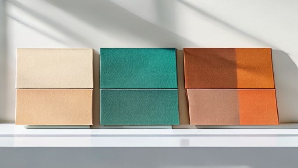
- Warm Neutral + Deep Teal: Cream or warm sand background, deep teal accent. Works brilliantly for tech, consulting, fintech. Signals innovation without aggression.
- Soft Charcoal + Burnt Orange: Light gray-brown background, warm burnt orange for emphasis. Perfect for creative agencies, marketing firms, and B2B SaaS. Feels experienced and grounded.
- Ivory + Forest Green: Off-white with deep forest green accents. Increasingly popular in sustainability, healthcare, and financial services. Communicates trust and stability.
- Warm Taupe + Plum: Softer, more contemporary option. The taupe feels elevated; the plum adds personality without screaming for attention. Strong for founder pitches and premium service positioning.
- Pale Slate + Copper: Gray-blue background with warm copper or rose-gold accents. Emerging trend for luxury brands, real estate, and executive coaching. Unexpected and memorable.
Notice what’s absent? Bright primary colors. Neon anything. Gradients (except in very specific, minimal doses). These palettes work because they respect your audience’s intelligence while creating visual hierarchy through intentional contrast.
The Critical Mistake: Confusing Brand Color With Presentation Color
Here’s where most designers and founders go wrong. Your brand color is sacred. It’s on your logo. It’s in your guidelines. And when you’re building a presentation, you think: I’ll just use my brand color as my accent color. Problem solved.
This rarely works. Your brand color was chosen to pop on a small logo. It may not have the same impact—or the same elegance—at 40% of a slide. More importantly, it may not play nicely with the neutrals you need to use for readability and hierarchy.
What I recommend instead: Create a presentation-specific palette that honors your brand without being enslaved by it. Use your brand color strategically—maybe on the title slide and final call-to-action. For the working slides, choose an accent color that’s in the same color family but more sophisticated. If your brand is bright teal, your presentation accent might be a deeper, more saturated teal. If your brand is energetic orange, your presentation might use a warmer, more muted terracotta.
This approach keeps visual coherence while avoiding palette fatigue. Your stakeholders see the brand DNA without getting visually exhausted by it over 15 or 20 slides.
How to Test Your Color Palette Before You Build the Whole Deck
I always insist on testing palettes with real people before committing. Most designers (and their clients) skip this step. They build the entire presentation, then realize the colors don’t feel right. Redesign. Frustration. Time wasted.
Here’s my process, and it takes 30 minutes:
- Create three low-fidelity mockups. Same five slides, three different color treatments. Nothing elaborate—just a title slide, a text slide, a data slide, an image slide, and a closing slide.
- Share with 5-7 actual stakeholders or audience members (not colleagues who haven’t seen the context). Ask them one question: “Which palette makes you want to keep reading?”
- Track which palette gets the most votes. Don’t argue. Don’t defend. Just note it.
- Refine that winning palette (adjust contrast if needed for accessibility) and build your deck.
This matters because color perception is subjective. Your preference is irrelevant. Your audience’s perception is everything. I once tested a warm taupe + plum palette against a more modern pale slate + copper option. I preferred the slate and copper. But 6 out of 7 stakeholders chose the taupe and plum. We built it with taupe and plum. The presenter reported higher engagement. Real data beats intuition.
Accessibility and Global Considerations: The Often-Ignored Reality
I’m not going to bore you with the technical specs of color contrast ratios. You already know accessible design matters. What most designers don’t consider is how color *meaning* changes across cultures and industries.
Green signals growth and health in Western markets. In some East Asian markets, green can signal infidelity or bad luck. Red means urgency in the US. In China, red signals prosperity and good fortune. If you’re presenting to a global audience or an audience with cultural diversity, your color psychology needs cultural intelligence, not just Western design trends.
Additionally, presentations for finance and healthcare have unwritten color codes. In finance, deep blue and navy dominate because they signal stability and trust. In healthcare, blues and greens dominate for similar reasons—trust and healing. If you’re presenting a fintech product in a forest green and burnt orange palette, you’re working against established expectations. Sometimes that’s a strength (disruption, differentiation). Sometimes it’s a weakness (lack of credibility).
My rule: understand the context before you create the palette. If you’re entering an industry with established color conventions, honor them unless you have a specific strategic reason to break them. Harvard Business Review published research showing that consistency with audience expectations increases perceived credibility by 23%. That’s worth respecting.
Tools and Resources for Building Your 2026 Palette
I don’t recommend using generic color palette generators. They’re often based on color theory algorithms that don’t account for real-world presentation context. Instead, I pull palettes from four sources:
- Design inspiration sites: Behance, Dribbble, and specific collections of financial services and B2B marketing sites. Screenshot palettes you respond to. Write down the hex codes. Don’t steal them, but learn from them.
- Nature: Spend 15 minutes photographing natural scenes—soil, water, leaves, sky. Extract colors from these photos using a color picker tool. Nature’s palettes always feel sophisticated because they’re inherently balanced.
- Luxury brand websites: Not because you should copy them, but because luxury brands employ teams of designers to perfect color balance. Visit watch brands, luxury hotels, high-end agencies. Study their palettes. Notice what they do differently from mass-market brands.
- Your competitors: What color palettes are your competitors using? Then do the opposite—not dramatically, but strategically. If every fintech startup uses bright blue, a deep navy with warm brass accents suddenly feels premium and differentiated.
For actual implementation, I build palettes in PowerPoint or in the tools we recommend for creating presentations online, but I also maintain a master file of tested palettes so my team can apply them consistently across decks.
If you’re also managing marketing copy, social captions, and brand messaging alongside your presentations, tools like Blaze.ai can help you maintain consistent brand voice and visual language across all channels without getting bogged down in copywriting.
Conclusion: Your Color Palette is a Business Decision, Not a Design Decision
The colors you choose for your 2026 presentation aren’t about aesthetics. They’re about persuasion, credibility, and audience psychology. Warm neutrals paired with a single jewel-tone accent have proven to work. Testing your palette with real stakeholders before full execution prevents costly redesigns. And understanding the cultural and industry context of your colors ensures you’re working with audience expectations, not against them.
The most common objection I hear? “This seems like a lot of thinking for just colors.” It is. And that’s exactly why most presentations fail to persuade. They treat color as an afterthought. The ones that move clients, close deals, and shift perspective? They treat color as strategy.
Need a presentation designed for you? TheSlidehouse creates professional slide decks for consultants, business owners, and entrepreneurs. Get started here →
Need a presentation designed for you? TheSlidehouse creates professional slide decks for consultants, business owners, and entrepreneurs. Get started here →
If you want to draft presentations faster without starting from a blank slide, Gamma is a practical option for turning ideas into polished decks and visual documents more quickly.
For additional research, see Nielsen Norman Group for research-backed communication and UX.

🎁 Free Download: 5 Slides That Win Clients
Enter your email to get instant access to your free Presentation Design Cheat Sheet + the 5 slides every winning client deck must have.
Frequently Asked Questions
What color palette works best for a tech startup pitch deck?
Tech startups perform best with warm neutrals (cream, soft white, or warm sand) paired with a deep, saturated accent color—typically teal, deep navy, or forest green. This combination signals both innovation and stability, which investors want to see. Avoid bright primary colors; they feel immature. Avoid pure gray and white; they feel generic.
Can I use my brand color as my presentation accent color?
Yes, but with caution. Your brand color was designed for a logo at a small scale. It may not perform well at 40% of a slide or across 20+ slides. Instead, create a presentation-specific accent color that’s in the same color family—perhaps slightly more saturated or slightly more muted—than your brand color. This keeps visual coherence while avoiding palette fatigue.
How many colors should I use in my presentation?
Limit yourself to three maximum: a background neutral, a primary accent color, and optionally a secondary accent for data visualization or emphasis. Using more than three active colors creates cognitive load and dilutes your message. Your audience should focus on your content, not on processing color variation.
Do color palettes differ by industry?
Absolutely. Finance and healthcare favor blues and deep greens because they signal stability and trust. Creative agencies can push warmer, bolder palettes because their audience expects personality. B2B SaaS is moving toward warm neutrals with jewel-tone accents. Understand the unwritten color codes of your industry, then decide whether to follow or strategically break them.